ar-datetime-picker
ar-datetime-picker
介绍
基于vue的移动端时间选择器,支持按年、按月、按日期的组合选择。
仓库地址:github地址
预览地址:Demo
安装
npm install --save ar-datetime-picker
引入
全局引入
 import Vue from 'vue'
import App from './App.vue'
import ArUi from 'ar-datetime-picker'
import "ar-datetime-picker/lib/theme-chalk/index.css";
Vue.use(ArUi)

Vue.config.productionTip = false

new Vue({
  render: h => h(App),
}).$mount('#app')
以上代码便完成了 ArDatetimePicker 的引入。需要注意的是,样式文件需要单独引入。
按需引入
npm install babel-plugin-component -D
修改babel.config.js:
 module.exports = {
  presets: [
    '@vue/cli-plugin-babel/preset'
  ],
  plugins: [
    [
      "component",
      {
        "libraryName": "ar-datetime-picker",
        "styleLibraryName": "theme-chalk"
      }
    ]
  ]
}
修改main.js:
 import Vue from 'vue'
import App from './App.vue'
import { DatetimePicker } from 'ar-datetime-picker'
Vue.use(DatetimePicker)

Vue.config.productionTip = false

new Vue({
  render: h => h(App),
}).$mount('#app')
Props
| 参数 | 描述 | 类型 | 参考值 |
|---|---|---|---|
typeOptions |
类型选择器 | array |
[{name: '按年', value: 'year'}, {name: '按月', value: 'month'}] |
type |
当前类型 | string |
`'' |
startTime |
开始时间 | string |
`'' |
endTime |
结束时间 | string |
`'' |
minTime |
最早起始时间 | string |
2020/1/1,为空时,默认为前十年 |
maxTime |
最晚结束时间 | string |
2020/1/1,为空时,默认为后十年 |
unlimitVal |
选择不限时对应的值 | string |
可为空 |
typeOptions为对象数组,固定由name和value对象组成,其中name可以自定义,value仅限制year、month和day。
API
| 事件名称 | 描述 | 参数 |
|---|---|---|
onComfirm |
点击确定的回调事件 | { startTime: string, endTime: string } |
onUnlimit |
点击不限的回调事件 | e:Event |
onCancel |
点击取消的回调事件 | e:Event |
Dome
<template>
<div id="app">
<div class="btn-wrapper">
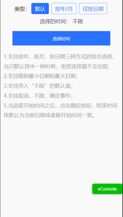
<span>类型:</span>
<div :class="selectType === 0 ? 'btn active' : 'btn'" @click="handleType(0)">默认</div>
<div :class="selectType === 1 ? 'btn active' : 'btn'" @click="handleType(1)">按年/月</div>
<div :class="selectType === 2 ? 'btn active' : 'btn'" @click="handleType(2)">仅按日期</div>
</div>
<p class="datetime-desc">选择的时间: {{time}}</p>
<button class="datetime-button" @click="handleClick">选择时间</button>
<div class="desc">
<p>1.支持按年、按月、按日期三种方式的组合选择,当只默认其中一种时候,类型选择器不会出现;</p>
<p>2.支持限制最小日期和最大日期;</p>
<p>3.支持传入“不限”的默认值;</p>
<p>4.支持取消、不限、确定事件;</p>
<p>5.当选取开始时间之后,点击确定按钮,结束时间将默认为当前日期或者跟开始时间一致。</p>
</div>
<ar-popup v-model="show">
<ar-datetime-picker
:typeOptions="typeOptions"
:type.sync="type"
:startTime.sync="startTime"
:endTime.sync="endTime"
:minTime="minTime"
:maxTime="maxTime"
@confirm="onConfirm"
@cancel="onCancel"
@unlimit="onUnlimit" />
</ar-popup>
</div>
</template>
<script>
export default {
name: 'App',
data() {
return {
selectType: 0,
startTime: '',
endTime: '',
type: 'year',
maxTime: '2022/5/25',
minTime: '2021/4/2',
show: false,
};
},
methods: {
handleType(type) {
this.selectType = type;
switch (type) {
case 0: this.type = 'year'; break;
case 1: this.type = 'year'; break;
case 2: this.type = 'day'; break;
default: this.type = 'year'; break;
}
},
handleClick() {
this.show = true;
},
onConfirm() {
this.show = false;
},
onCancel() {
this.show = false;
},
onUnlimit() {
this.show = false;
},
},
computed: {
typeOptions() {
switch (this.selectType) {
case 1: {
return [{
name: '按年',
value: 'year',
}, {
name: '按月',
value: 'month',
}];
}
case 2: {
return [{
name: '按日期',
value: 'day',
}];
}
default: {
return [{
name: '按年',
value: 'year',
}, {
name: '按月',
value: 'month',
}, {
name: '按日期',
value: 'day',
}];
}
}
},
time() {
return this.startTime ? `${this.startTime} 至 ${this.endTime}` : '不限';
},
},
};
</script>
<style lang="scss">
#app{
display: flex;
flex-direction: column;
align-items: center;
}
.btn-wrapper{
margin-top: 10px;
display: flex;
align-items: center;
.btn{
padding: 0 10px;
margin: 0 4px;
line-height: 32px;
border: 1px solid rgba(41, 113, 255, 1);
border-radius: 4px;
color: rgba(41, 113, 255, 1);
}
.active{
background: rgba(41, 113, 255, 1);
color: #fff;
}
}
.datetime-desc{
color: rgba(64, 64, 92, 1);
line-height: 44px;
}
.datetime-button{
display: block;
height: 44px;
width: 80%;
margin: 8px 0;
background: rgba(41, 113, 255, 1);
color: #fff;
line-height: 44px;
text-align: center;
outline: none;
border: none;
box-sizing: border-box;
}
.desc{
margin: 10px;
line-height: 30px;
color: #999;
}
</style>
TODO
- 引入
typescript; - 完善测试用例;
- 加入
popup弹窗,可与时间选择器搭配使用; - 使用GitHub Actions;
- ...
Dependencies
Dependencies
@vue/cli-plugin-babel: ~4.5.0@vue/cli-plugin-e2e-cypress: ~4.5.0@vue/cli-plugin-eslint: ~4.5.0@vue/cli-plugin-unit-mocha: ~4.5.0@vue/cli-service: ~4.5.0@vue/eslint-config-airbnb: ^5.0.2@vue/test-utils: ^1.0.3babel-eslint: ^10.1.0babel-loader: ^8.1.0chai: ^4.1.2cp-cli: ^2.0.0css-loader: ^4.2.2eslint: ^6.7.2eslint-plugin-import: ^2.20.2eslint-plugin-vue: ^6.2.2gulp: ^4.0.2gulp-autoprefixer: ^7.0.1gulp-cssmin: ^0.2.0gulp-sass: ^4.1.0node-sass: ^4.12.0sass-loader: ^8.0.2style-loader: ^1.2.1vue-loader: 15.9.3vue-template-compiler: ^2.6.11webpack: ^4.44.1webpack-cli: 3.3.12webpack-dev-server: 3.11.0